Standard Grafik
Introduction
Here I gather all my thoughts related to my graphics production
I seek freedom, not challenge, I have an assortment of styles I use and that is that.
Bruks style is for me, I don't have the time or resources for celebratory styles, I don't like the constraint of compability styles such as SNES styles, so I look to the mid/early 2000s for stylistic inspiration.
I don't like the cutesy tootsy graphics of PS1 or SNES, minecraft, undertale, stardew
I don't like the prestigeful graphics of PS3, PS4, 2010s gaming PCs, unreal engine, frostbite
I like the full range of expression graphics of mid 2000s pc/ps2, To the Moon, Counter Strike Source, Skyward Sword, RPG maker, Source, early Unity
Vedurs Standard Graphics Style List
For every style there is a person I associate the most with it, who did it best, who did it with intention, or both.
I use the list below and think no further, excentric styles are not for me.
Sexy graphics rawr, catty.
To punga in or punga ut, that is the question.
I try to only have the timeless classic styles here.
No quirky sh*t.
types: 1. begrenzt/süß/crude 2. Skizzieren/Bruks 3. Celebratory/Dedikation/HQ
Effectors: Scanned, construction levels, detail level, digital, Pixelart, Cluttered, Spacey
Palettes
Use defined palettes, use a uniform color language.
Defined palettes help give art a clear mood.
neutral palettes give art a neutral feel.
* Fantasy 24
* Endesga 32
* Natural Palette with accents, keep saturation mostly around 30%
* Flat and integrated palette
* High Contrast Saturation pump palette
* Open Mind Palette
* Mcquarrie, Neutral or non-circular shades
memorable Colors: Full blue, Steel blue, army green, Cadium yellow, skin pink, skin yellow, warm grey, cold green
2D/UI:
1. Minimalism & Metaphors => Win95, South Park
1.5 Fantaisie des Oreillers => Undertale, Stardew Valley, Terraria, Pippi DOS, SMW
1.5. E-sketch => 4chan oekakis, To the moon, early 200s web art
1.5 E-gouache => gouache but pixel art
2/3. Rough Comics => Meat boy, Bully, Skullkid
2/3. Ligne Claire/Anime/manga => Tintin, Pat Hines, Artindi, Yotsuba, Hayao Miyazaki, One-punch man, K-on, pokemon, Only Yesterday
I always use square paper when I sketch.
also for me:
Manga > Rough Comics
I prefer the look of those thin, defined, fine lines over those rough, fluid, thick lines.
2. Gouache/watercolor sketch => Mateuz Urbanowiz, Jens Ahlbom, Hayao Miyazaki, Kiyohiko Azuma
3. Oil Painting => Ralph Mcquarrie, Mark Ferrari, Anders Zorn
Drawing Construction:
1. Süßfigurs => Phantom Hourglass, Miis, Animal crossing
2.5 !!Technical Construction!! => Mulle Meck, ralph Mcquarrie, 90s DOS games, video games,
2. Linguistic Construction => Ralph Mcquarrie, Mulle Meck, Tintin, Loranga Dartanjang och Masarin, Disney, Kings Quest DOS, 90s adventure games, Hayao Miyazaki, Pat Hines, Pippi DOS
3. realistic/traced(Zorn)
3D:
1. Box Feltwerk 3D => Minecraft
1.5 Feltwerk 3D => Runescape, Zelda Phantom Hourglass, CS 1.6, Mario 64
I don't think there's a point in going for photo textures until you reach a certain resolution.
2. Bruks/linguistica Photogrametry/photo textured(HQ flat textures, mid quality models) => Half life 2, Counter Strike source, Henrike Magnofico retextures(low poly, but HQ textures) !!Black Mesa!!, Oblivion, Amnesia, Call of Chtulu, Postal, Flight Simulator X:
* Easy/fast to make game assets, good for indie developers * Can utilize high end and low end PCs
2. Bruks/linguistica Gouache => Skyward Sword, Team Fortress 2
3. Dedication Photogrametry => Flight Simulator 2020, Battlefield 3, Battlefield 4, Red dead redemption
Video/Photography:
1. CCTV camera
1.5 cheap camera setup => 2000s JVC Camcorder
2/4. Basic Camera Setup => Sony ZV-1
3/4 Advanced Camera setup => Nikon F3
720/1080p = bruks resolution
16mm, 4k = indie resolution
30mm, 8k/16k = Dedication resolution
It has taken a crazy amount of time for digital to catch up to film.
The "film feel" to me is just the feeling that you're giving it all.
If the camera is cheap then I assume that is how you value what is on the screen, cheaply.
Graphics Settings Levels
Actually the SD and HD system could actually be useful, since it is more indicative of what type of PC you need for said setting.
It's also more indicative of the developers opinion on that graphics level, if it's a good experience or not.
SD => 2010 PC, bruks tier
HD => 2015 gaming PC, special tier
The SD and HD system was my inner jew writing, simple, but doesn't really say what's going on.
Convenience to the point of dysfunction.
Replaces old LOD system, 4-9-2025 ~kl 19:00
Model Texture Level: * 20px/cm * 10px/cm *5px/cm * 1px/cm
Model Vertex Level: * 5vrtx/cm 1vrtx/cm * 1vrtx/5cm
Map Texture Level: * 1px/cm * 1px/dm
Map Vertex Level: * 1vrtx/dm
Replaces old LOD system, 4-9-2025 ~01:00
HD = looks crisp, 1080p, photoreal texel quality @ 1080p => Henriko Magnifico retextures, Black Mesa
SD = 720p, slightly blurry textures, photoreal at low resolution => Half Life 2, Counter Strike Source
Compability = 480p, blurry textures, => Counter Strike 1.6
Post Processing:
* Film grain => fragility
* Colder Colors => seriousness
* Bloom => etheral, almost surreal, spiritual
Mastering Constructio Linguistica
linguistic construction IS NOT shapes construction
Compare 3D anime to 2D anime.
One looks mathematical, superflous and stiff, one looks dynamic and expressive.
One has mathematically perfect ratios and perspective, one has dynamic ratios and perspective snapping
One use case of blending linguistic construction and shape construction you've probably seen is the movie "The Iron Giant"
The boy is linguistic construction whereas the iron giant is shape construction.
These different construction methods have different strengths and weaknesses.
* Building a vocabulary for drawing animals and people!!!
* Gesture lines/shapes
* Constructio Linguistica is still 3D, but with many many eye pleasing simplifications, avoidant of mathematicality.
* make actual stories, that is no.1, don't waste time learning obscure angles
* 2D Silhuettes => impressionistic, chaotic, interesting, linguistical, deforming, build a common silhuette library
* 3D construction => fine control, technical, time consuming, mathematical
* copy f*ckton of silhuettes and improvise, make sure to stay in a 2D language mindset
* Make f*ckton of animation keyframe skeletons, religiously following the underlying shapes
* Perspective snapping/Perspective Simplification => 45deg down to object? front snap a bit, 10deg down to object? top snap. Snapping keeps the projection linguistic
* Line meetings
* Rounded fyrhörningar
* Symbols and more symbols
* Beveled boxes
* line beveling
* obstructed objects small, clear view big
* Bulge points
* Slight yankiness
* Drawing at different scales and different focus, indie devs learn this fast:
* Detailed level(expressive and proportional face, detailed wear)
* rudimentary level(face has features but rudimentary, unexpressive, rudimentary wear)
* Doing art for games, video games, board games is a nice way to start.
It's very satisfying because you get to reuse the same art piece over and over.
Make pieces that you can move around rather than one big static piece.
Generally, silhuettes are better for humans and animals and 3D construction is better for hard objects and technical illustrations where precision is necesarry.
In animation though understanding 3D shapes becomes really important.
Perspective practice list:
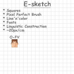
* O-FV => Orthographic Forward View
* O-SV => Orthographic Side View
* O-TV => Orthographic Top View
* O-WV => Orthographic Window View
* OPP => One Point Perspective
* TPP => Two Point Perspective
* OB => Oblique
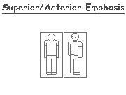
Camera-relative Emphasis/ de-emphasis types:
* Anterior emphasis => increase size, prioritize lines
* Superior emphasis => increase size, prioritize lines
* Posterior de-emphasis => decrease size, deprioritize lines
* Inferior de-emphasis, deprioritize lines
Common Constructions
* fat 4 legged animals = mentally hang a bunch of bags onto a skeleton
* fit 4 legged animals = make the bags solids instead of loose rocking bags
Perspective subtleties:
* convexing of lines Superior/inferior to horizon
* concaving of lines Superior/inferior to horizon
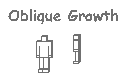
Oblique growth:
Absolute favorite.
Oblique growth is a personal sketching method which consists of drawing a character/object first in frontview/sideview then growing the different sides slightly
Extremely effective and easy to use to create complex perspective fast.
* Right'n'up growth, Anterior emphasis
* Left'n'up growth, Anterior emphasis
With constructio Linguistica/constructio concreta I want to create a model/vocabulary as useful as step analysis and melodic analysis to illustration.
It is crazy how much just a bit of vocabulary improves your creative ability, once you understand what elements you are working with you skyrocket.
UI
Strive for colors that imply natural materials: Wood, paper, metal, rock, sky, water, clouds.
They are easier to relate to.
Metaphors, natural palette
Pixel2line ligne claire
You can turn pixel ligne claire into line ligne claire by first marking line starts and endings and just interpolating smoothly between the pixels of the line.
The color fields should of course be made to fit in the lines.
Watercolor Sketch/Ligne Claire Workflow
Tools:
*
sharp pencil
* Technical pen
* Eraser
* Scanner
* Computer
Workflow:
* gesture/composition
* lines
* color block...(I've written a separate part on coloring/rendering)
Analogous UI
UI should have analogies to be intuitive to use, but analogies must maintain clarity, they can't be so convenient the user stops understanding what they are looking at.
Pillow Fantasy
Called pillow fantasy because everything is pillow shaded.
* Clear lines, any color
* 1-3 shades per object
E-gouache
* Gouache layer
* Painting individual elements and combining into bigger thing, digital pro tip
* Watercolor layer
* Paper layer
* Noise layer
Eras of digital graphics/audio:
* Minimalist era => 8-bit, NES, super mario Bros
* Cutesy Tootsy era => 16-bit, SNES/Playstation 1/Nintendo64(not 64-bit, but looks chunky as f*ck), Undertale, Minecraft, Super mario World
* Expressive/free era => 32-bit/64, Low End PC/PS2/Wii, To the Moon, Wizard101, Counter Strike Source, Far Cry, Early TF2, Portal, Day of Defeat Source
* Realistic era => 64-bit, High End PC/PS3/XBOX360/PS4, Battlefield 3, Call of Duty Ghosts, CS2
2005 Bruks Graphics
* Immersion
* Billboard clusters possible thanks to GPU instancing
* waist-height floor texture for grass long away
* 32x32 free palette sprites
* 32px/m minimum texture LOD
* Higher texture and model LOD on smaller objects
* LOD-consistency, f'cked up a lot these days
* Flat Textures
* Grayscale Analogues
* Sense of creative freedom, rather than realism stressing
* "How much do I need" instead of "how much can I get"
* simple shading model
* 3D models aren't origami, but they aren't perfectly smooth either.
* Textures aren't more than needs, 512px/m -> 1024px/m
* No repeating pattern tiles please.
* UI is 1 to 1 pixels.
* gesture gradients in models
* Contact occlusion
* Shape Casting
* CD-quality audio
exanmples: Skyward Sword, Battlefield Heroes, Super Mario Galaxy, Counter Strike Source
3D Graphics Techniques List
It's really only at the last stage, lightning, that you should start thinking about bigger contrasts. Until then everything should be flat.
that's where you can start thinking spectacularly.
LODs:
* LOD 1: photoreal on desk(4k textures, win7 forward)
* LOD 1.5: photoreal from 5/10 meters(Counter Strike Source, PS2/WinXP era)
* LOD 2: photoreal from 50/100 meters(Counter Strike, PS1/win95 era)
Ambient Lightning:
* Baked gesture gradients(gradients applied artistically)
* Baked ambient occlusion(occlusion applied mathematically)
* occlusion shapes(darkens neighbour objects, not parent, according to shape, usualy quite simple shape)
* Vertex crevase occlusion(darkens neighbour vertexes based on angle, good for hands, wrinkles, detailed ambient light)
* Bloom
greater lightning:
* light shapes(lightens objects within, detail level low)
* Shape tracing(same as above, greater bounces)
* occlusion shapes(darkens the part of the object not hit by light, again low detail)
* distance fog
Modeling techniques:
* avoiding creases
* more vertexes at bends
* baked gesture gradients
* Baked AO
* 50% texture 50% color
* gesturely edge flow
* Polygon modeling
* Camera-facing billboards, vegetation, clouds, smoke
* static billboards
* Edge billboards = desharpens edges, rocks, grass
* Edge shaders/effects = same as above
Boosting texture contrast vs boosting shape contrast
You can boost the contrast in an image in different ways.
You can boost texture contrast, high frequency information.
You can boost shape contrast, low frequency information.
If your goal is dramatic composition, you boost shape contrast.
If your goal is maximum texture clarity, you boost texture contrast.
Ligne Clair Workflow
1. Create paper sketch/pixel art sketch
2. Go into Krita
3. use clear ligne brush
4. use very high stroke smoothing for smooth lines, use less for jaggy lines, bushes and such
5. create line layer
6. paint over sketch
7. add color fields layer br
Abstract high resolution format
Storing photos of 4k textures consumes massive amounts of storage space.
What if there was a way to get all the richness of high resolution models without the massive storage consumption?
Store an abstract description of the texture rather than an a photo.
store the big shapes(plank meetings, shade shift, gradients, color blocks)
store the smaller shapes(cracks, waves, blotches)
store the micro shapes(fine noise, fine patterns,)
It is still important to get as much details as possible.
Photography/Videography
Things I focus on recently(14-8-2025)
* Life surrounded by stillness vs life surrounded by chaos.
* Assertion of beauty.
Texturing principles
Textures should be texture, not shapes.
Too much contrast in a texture will destroy shape clarity.
Mastering Constructio Concreta
* 3D shapes, 3D shapes, 3D shapes
* Surface lines, surface lines, surface lines.
* Perspective lines, perspective lines, perspective lines
Limiting toolset to show dedication/celebration
It is common for painters to limit their toolset to show greater dedication/prestige
I like to say there are functional drawing/painting styles and prestigeful drawing/painting styles.
Prestige Examples:
* Blotch painting
* pencils only
* Ruler-less painting/drawing
Functional:
* Full toolset painting/drawing
* grayscale pencils
* Rulers
Line vs Lineless
Lineless = more immersive, less clear construction
Line = better clarity of construction, less immersive
Minimalism Workflow
I prefer OS UI to have a computery look, to further feed the separation of fantasy and reality.
* Raster Version(helps with maintaining smallest unit)
* High res version(high res version, preferably both SVG and PNG)
* Silhuette version, then color version
* Lower res exports
* Icons => 128x128
Mio mim Mio style videography
* Lite lo-fi
* overdub for clean audio
80s Box Design
I prefered software packaging in the 80s and early 90s.
Analogue graphics System
I have this super weird idea in my head of an analogue graphics system.
Like the graphics are actually in a box of moving models.
That would be an interesting game.
LOD types
texture LOD
Texel LOD
object LOD
Shading LOD
Micro Texture Levels
* Clean
* Marble
* Rock
3D-LOD levels
Things I want to see in the graphics settings:
tpx/spx@1080p = texture pixel per screen pixel at viewing distance @ 1080p
vrtx/spx@1080p = vertex per screen pixel at viewing distance @ 1080p
Model Texture Quality = px/cm^2
Model Vertex Quality = vrtx/cmm^2
The indie software scene
The indie software scene and E/Web has always been dominated by bruksgrafik and bruksljud.
It is where creativity thrives.
Unthoughtthrough Graphics
It's bothersome how unoptimized and un-thought-through much of todays graphics are.
Graphics that are neither bruks or dedication.
Minimalism with ubershaders that look like nothing and burns your computer.
Texel density can be quite garbage in supposedly dedication tier graphics.
DOS, PS1, Nintendo DS
The PS1, DOS PC, and Nintendo DS are aesthetically my favorite platforms.
Those platforms have timeless bruks tier graphics for every single title, no exceptions.
PS2, XBOX, XBOX 360, PS3, Gamecube, N64 they all aimed too high.
They tried to hide digital artifacts through blur.
They were ashamed of what they were, and that is what ruined them.
I love how the indie software scene embraced bruks aesthetics.
Unashamed pixelation and digitalness.
We need way more of that, way less half arsed attempts at realism/dedication.
Lo-Fi
Adds warmth, fragility and seriousness.
Sometimes you want a feeling in the image that is less sterile, maybe because you want it to feel more fragile, so you add some authentic detoriation.
From the 90s to the 2000s everything was sterilised, which is a shame, everything shouldn't have a sterile image.
I prefer using authentic detoriation over fake detoriation.
* VHS-pass
* old video cam pass
* Film-pass
* CRT-pass
Making Textures
* Generally low/mid contrast
* Avoid white roof/black floor
* Generally, texture! not form! super common mistake, people try to put rocks, handles, windows on a texture, in begrenzt graphics styles you sometimes do that
* in case of painting, detail on every level, block, blotch, fine, micro
* GO, gesture occlusion, map
E-sketch
"Oekaki" refers to a sketch style common on the early internet.
Oekakis are made using pixel perfect brushes, giving them a very digital "E" look.
Digital is embraced, very very bruks.
I just call them E-sketches, or E-skizziren, because I don't like japanese lone words for common words.
Filters/Color language
I think filters are a good tool for the photographer to make their photos more assertive.
Filters in combination with standard color language can be a tool for telling the viewer how to feel about the content.
Magenta = Seriousness
Contrast boost(no saturation boost) = seriousness
Saturation pump = playfullness
Neutral = science
Boosted reds = love, romance
Low Saturation = bleakness, misery
Selective boosts = forwardness, formality, hope, hiearchy
Warm Dark(Fantasy-24) = epic, Fantasy, fever dream, dreamish
BW = Death, tradegy
Black = Elite, intelligence, seriuos, competence
White = stupidity, clueless, fumbling
Black and cool red = cosmicality, reality, serious/cosmic love(Pure red represnts a different kind of love, more goofy/tame)
Story Boards
* A försatsblad with character sheets, symbol explanations, palettes.
* each page 4 to 60 squares, text, dialogue, composition
Metaphoric Minimalist UI
Metaphors is essential for quick orientation in any application.
* Tool/place metaphors
* Smallest unit
* Balanced contrast
* Separation through value first, line second
* If separation through line, line should be within top object
Making 3D objects look more together
* Intersection smoothing
* Ambient Intersection bounces
* Contact occlusion
Texture Filtering New Statement
I have said that texture filtering for low resolution textures isn't bruks but you know what,
If you following the rules of good texturing I do not mind the filtering.
Removing texture filtering starts looking good at those low LODs, LOD 2.
Mario 64 looks better without texture filtering.
I don't want to imagine minecraft with texture filtering.
yeah yeah.
LOD 2: no texture filtering
LOD 1.5>: Texture filtering
I believe that texture filtering comes in two types though:
* Non destructive for detailed textures, blurs pixel edge less that one pixel, grass, sand, wood, anything grainy
* Destructive for textures that are more gesture, like water or sky, blur greater than one pixel
So a texture should be marked as either being either gesture or grainy.
Proper Anti Aliasing!
The reason why you don't do texture filtering above LOD 2 is because it cost processing power.
and compability tends to becoem priority then.
but you can do texture filtering there also!
I've also seen people do 3D models with texture filtering, but UI images with clear pixels.
It makes sense, you want a clear edge on UI elements.
Unless they are polygonal UI elements, don't have texture filtering.
So,
compability:
* no texture filtering
Bruks:
* ~0.3 blur for grainy textures
* 1+ blur for gesture textures
* 0 for nonpolygonal UI elements
Common Photogrametry/Gouache 3D Levels
Remember it is a spectrum!
Conmpability/Feltwerk:
* LOD 2
* Map sketchers probably like feltwerk the most, fastest to sketch in
* Quake, Counter Strike, Day of Defeat
* Blocky models, hence the name feltwerk.
* pixelated textures
* Flat lightning
* No AA
* Somewhat goofy and unimmersive
* You can do AA and texture filter if you want, looks good as well
* pop-in LODs
Bruks/semi-realism/constructio-linguistica:
I prefer Animation movies that don't move above this level, beyond this level all the details start being distracting.
Information overflow.
In the mid 2010s a bunch of games and movies moved beyond this level and my eyes just started being annoyed by all the damn detail.
It's the jump from the wii to the wii U, I didn't like super mario odyssey.
The reason why I like this the most is because introducing micro details makes elements look less clearly separated, and you don't want that in a game.
I really like the clone wars series because it has an animation style that isn't massively micro detailed.
It has aged really well.
Simplicity ages well.
* Combining shape-casting and SSAO is a good balance between realism and speed.
* Highly immersive
* LOD fades(Use lower sample count of background if it is too expensive, please no pop in LODs that sh*t is so ugly)
* 4x MSAA(I refuse anything less than that, I will lower the screen resolution rather than give this up)
* LOD 1.5
* Models are not blocky and do NOT look like paper fold art, though they are slightly edgy. If something looks like paper fold art that isn't a distance-LOD you are doing something wrong.
* LOD is higher on smaller models
* Counter Srike: Source, Flight Simulator: X, FLIGHT SIMULATOR 2004 OMG OMG, Day of Defeat: Source, Skywards Sword HD, Battlefront II
* Billboards/shell shading for particles
* grass tiles with slightly lowered collision geometry
* Blend of HD textures and mid-textures
* non-realistic, but very pretty shaders
* AA
Realism:
You need a good reason for this, most times I see this it is over-detail, superflous.
I feel that with many games, all the detail actually makes it worse, I can't focus.
HD remasters of game from around 2010 is what I would consider optimal for dedication.
* LOD 1
* Sleek, photoreal models
* Fully detailed particle systems
* HD textures
* realistic lightning model
Animation
* Keyframes
* Interpolation:
* Linear for smooth easy movements(idling, grabbing,)
* acceleration and deacceleration for faster movements(walking, running, climbing, rotating)
Simple photogrametry
! SHOULD RUN ON A BRUKS TIER SYSTEM!
* LOD 2-1.5 vertex density
* LOD 1-2 texture resolution
* NO anti aliasing
* NO texture smoothing
* NO real time ray tracing
* direct lightning
* NOISE TEXTURES
You can have GSCO on a rendering level or on a texture level.
* GSCO = Geometric/Spatial clarity Occlusion(depth gradient boxes, wall gradients, front2back gradients, contact shading, )
* Textures, preferably a bit flat, not extreme contrasts
* Simpler lightning systems(light boxes, geometric and spatial clarity oclusion)
* A balance between resolution, shader realism, and model quality(I see a lot, A LOT of mismatch between model quality and display resolution, why are you displaying these low poly models at 4k with ray tracing, why?)
BRUKSLEVEL AND PIXELPHOBIA DO NOT BLEND!
* Light boxes
* Shadow boxes
* LOD pop-ins(avoiding pop-ins belongs more to 3/4)
What level to use?
We definetely live in a time(2025) where there is too much obsession with photorealism.
Photorealism has a time and place, and it isn't always.
I want more bruks level graphics, focus on story and communication, not realism.
I like the Clone Wars series because it doesn't look like the product of some photorealism obsessed savant with access to a rendering farm.
100% focus on story.
I also like SFM animations.
I really just want the PS2 era but with higher resolution, quit all this photorealism OCD.
You know watching a vlog in 4k60fps OLED truecolor 360 audio stabilizer is just so overkill.
1080p + camera microphone, bam.
DON'T GO OVERKILL, GO BRUKS MAN!
Computer Graphics Eras
Computer graphics have progressed from limited, to bruks, to dedication and here I label where the transitions happened:
Limited: 1960-2000(NES/SNES, PS1, N64,DOS PC)
Bruks: 2000-2007(PS2/PS3, XBOX/X360, Gamecube, Wii standard PCs, DirectX9-11, OpenGL)
Dedication: 2010-2025(PS4, XBOX ONE, Gaming PCs, DirectX12, Vulkan, Mantle)
Left hand vs Right hand
Something that helped me learn how to use the right hand was thinking of the pen as a mouse.
Just like I access the computer with a mouse in my right hand I access the paper with a pen in the right hand.
Try it out I recommend.
View Distance to Width Ratio
For art to be viewed as the artist intended you should have a "view distance to width ratio" in the metadata of the art.
For example a small painting has a size of 30cmx30cm and is viewed originally from 50cm.
It can be made bigger, but the ratio must be maintained.
50/30
100/60
Simple Photogrammetry Expression
Simple photogrammetry has that japanese style philosophy to it.
Ease of expression, simplicity and freedom over realism.
The style bends to the artist rather than the artist bending to the style.
What is also nice in this art style is that the job of reducing the scene to the relevant abstract elements is already done, less processing for the person.
The graphics of the 00s could have been as catty as the PS1 if they didn't add all that FAA and texture smoothing making it into a blurry mess in the name of making it "realistic"
The push for realism in the 00s was a mistake, makes me think of the N64 with those horrible smooth textures.
pre-texture-colors
I like the 3D-model to be wood colored and particles to be paperbits when I have not added textures yet
and the world background is my work room.
Süßfigur
Begrenzt tier.
A Süßfigur isn't a style or anything, it's just what I call small figures that are easily replicable.
They have a very simple figure and a very simple face.
Such as:
* Toon Zelda Characters
* MIIs
* Animal Crossing Characters
* Matrjosjka
PFPs
Profile pictures are supposed to carry the soul of the individual, so I prefer them to be sketch or dedication tier.
Superfluous
Don't make your graphics, code, music superfluous.
Everything does not have to be AAA graphics
Everything does not have to be C coded hyperefficent
Everything does not have to be 20khz real recordings
Everything does not have to be 4k 44khz audio 60fps video
BRUKS, BRUKS, BRUKS AND MORE BRUKS!
Paint Brushes n pencils
ALWAYS RELATE BACK TO THIS WHEN DOING DIGITAL PAINTING.
wide brush = color blocking
blotchbrush = color blocking smaller objects/shading
pen = shading/details n texture
Hair strand brush = fine shading
2D painting LODs:
LOD 4: 5cm brush, mega block brush(blocking ~10cm^2)
LOD 3: 1cm brush, brush(blocking areas ~1cm^2)
LOD 2: 0.3cm brush, Blotches(color shift on a rock)
LOD 1: 1mm brush, Fine details(Hairstrands, edges, wrinkles)
LOD 0: 0.5mm paper/noise, Micro details(Surface roughness)
 Painting/Sketching Workflow
1. Construction(2D, 2D+3D, 3D, tubes, muscle implications, skeletons)
2. Block
3. Gradients
4. Bevels
5. blotches
6. Fine details
For micro details I always use texture/noise files, in the same color as the object
Digital Gouache Emulation
Ocean Waves
Have lots of noise if the texture is grainy, have less noise if the texture is very fine, highlights and shadows tend to lack noise even in grainy textures
layers:
top: Sketch layer
mid2: thicc paint details
mid: watercolor blocks(Colors preferably a bit wavey)
bottom: Noisy paper
Pseudo Tools:
* color pencil
* blotch brush
* blob brush
* wide brush
* Vegetation brush
* Spray
Pixel Shaming
In the rush to be able to claim "photorealistic" graphics first developers would blur things to hide the digital artifacts.
This reduces detail, but increases photorealism, since you see blur in photographs more than pixels.
Pixel shaming has ruined many consoles and games and made their graphics unsexy.
If you want to blur everything in the name of photorealism you should do that on a display level, not on a render level.
I want those sexy pixels.
Maybe I would do a post process blur, or CRT-hardware blur at most for boomers who are pixelphobes.
TSAA
I really like TSAA, texture smoothing anti-aliasing.
Some developers use texture smoothing on everything for some reason and that really bothers me.
texture smoothing only works as anti-aliasing where there is supposed to be smooth gradients instead of blotches.
if you add texture smoothing to a grass texture those grass strains are not de-aliased, they straight up dissapear.
Worthy Mentions
* Rough Comics(Disney, Newgrounds, Bully, Skull kid, Super Meat Boy, Minecraft Logo) = Sketching, technical sketchs, Storyboards, day2day, animation, world building, furries, this or ahlbom whatever is your taste
* Mark Ferrari(Amazing colors, amazing craftsmanship, good composition)
* Yotsuba
Use case for pixelart/rasterart
Pixelart/rasterart has traits that can be advantegous in certain situations lets go through a couple:
* Low resolution display
* Low storage capacity
* Low capacity graphics card
* phyiscal grid medium, shirt sewing, plops, tiles, panes.
* Fast sketching, bruks
My growing love for SVGs
At first I didn't like them, too hard to make, though once I started feeling like I understood the software I started really liking svgs.
SVGs can be used to make dynamic pixelart using a translator.
I didn't think SVGs were good for sketching, but I've started doing that as well in SVGs, once you can make them with speed it is fun and also it requires low storage capacity/bruks.
Fonts
* Times New Roman = "Extra" titles font, bread-text-font
* Arial = Titles Font
* Segoe UI = chat/notes font
* Comic Sans = Comics
* Courier New = Code/Typewrite/Telegram
Pixelfonts:
* Minecraftia
* Silkscreen
* vt323
* MS Gothic
Gear
* D-Cam with zoom
* !!Manual-settings-maxx!! my latest purchase, zv-1, does not have manual focus in video mode what the h*ck
* 1x-30x zoom(mostly optical, but also digital)
* ~720p 60fps = basic, ~4k 45fps = HQ
* Coolpix b500/b700
* Fixed Zoom Draw Screen(Only change pencil size, to mimic physical medium)
* tripod
* SQUARES PAPER
* Gouache
* Watercolors
* W&N cubes
* pen
* Aseprite
* Blender
2D-LODs
Illustration Resolution = px/cm^2
A common mistake I see people make is to only draw at one LOD-level and thus never develop the ability to make an advanced composition.
0.5cm-squares-paper + sharp pen(0.5cm/16 tip) relative LOD-zones
16px/cm density, 32px/cm. When I do digital art I still think more in terms of centimeters than pixels. "How big is that sword illustration? 8cm at 32px/cm, 1px pen tip,"
Use all of the color bits! Do not hold yourself back!
Be comfortable drawing at different LODs(level of detail)
Be okay with objects only being identifiable through context
Remembering LODs through characters and styles is effective.
The list below is how I orient myself while drawing/sketching:
~square/0.5cm^2: Emojis, cow-blotches, blotch-mario, house-blotches, vegetation-blotches, cloud-blotches, head-blotches, group-blotch (Extremely-far-away/extremely small)
~2^2-squares/1cm^2: blobby SNES characters, SNES, small mario, small Mega Man, small Yoshi, 16px blocks, (far away, small)
~4^2-squares/2cm^2: Thinner/lankier SNES characters, Big mario, Big Yoshi, Big Mega man,(medium)
~8^2-squares/4cm^2: Mulle Meck, Patrick Hines, Simpsons characters, Tintin, (close/big)
~16^2-squares/8cm^2: texture, dedication-level (Very close/very big)
I keep fine tuning these LODs.
A shoutout to Brandon James Greer who also teaches in a LOD increment style.
Another LOD-scale is letter-make-out
3D-LODs
LOD = level of detail:
LOD 7: 1px/vrtx/1km
LOD 6: 1px/vrtx/100m
LOD 5: 1px/vrtx/10m
LOD 4: 1px/vrtx/m
LOD 3: 1px/vrtx/dm,
LOD 2: 1px/vrtx/cm, photorealistic from the corridor
LOD 1: 1px/vrtx/mm, photorealistic on your desk
LOD 0: 1px/vrtx/0.1mm, photoreal right infront of your eye
Another important method of measuring LOD is texel resolution.
How many pixels on the screen does the texture of the object corespond to?
Far away objects can have a low texture LOD, but a high texel LOD because they take up such a small part of the screen.
Chunks
Rendering evrything at once does not work, so we render chunks of different size and resolution:
Massive chunk chunk: 1km
big chunk: 100m
chunk: 10m
small chunk: 1m
Map Designing
1. Paper sketch, theme, style
2. Chunks division, chunk layers
3. software modeling, texturing and lightning
Cameras
Things I like
* 100mm+ zoom level, high zoom levels
* Tripods
* High F-stop
* Bruks tier cameras
* Extra tier cameras
* High shutter speeds
* As high as possible ISO
* Dim/soft lightning
* Saturation pumping
* Contrast pumping
Legos
I do not really like human colored skin in legos.
Imagine if all the yellow simpsons characters became white, that would be weird.
I very much prefer yellow skin color for lego adaptions of white characters.
Yellow Lego star wars figurines from the 90s that's the stuff man.
Design Sheet
Design sheets contain information about the rules of a design, for example:
* 0.5cm borders
* Arial font
* Flat color background
* Separation through value first
* Sharp corners
* Natural Palette
Please use design sheets or stuff gets yanky fast!
Quirkiness
I dislike it when people try to be quirky for the sake of being quirky.
* I dislike quirky games.
* I dislike quirky movies.
* I dislike quirky art.
* I dislike quirky Music.
* I dislike quirky clothes.
* I dislike quirky social structures.
* I dislike quirky food.
* I dislike quirky people.
* I dislike quirky women especially.
* I dislike quirky japanese men especially too.
but also
* I dislike trend emulation in men.(not in women)
It is just disorienting and a waste of time.
FOR THE LOVE OF GOD DO NOT BE A QUIRKYMAXX PERSON.
I get nausea, really bad nausea from the entire "muh style" people.
For the love of god "your style" can go f*ck itself.
Every single "muh style" person I've met was a too-far-up-their-ass demented narcissist hyperautist who needs to touch grass.
It is on the same level of autism as creating new languages.
Maybe funny once in a star wars movie but you are soo damn laate holy sh*t.
You need a damn good excuse to create a new language, and you probably do not have one.
Im very tired of goofers so I want basic style and keeping goof to a minimum.
I think most people have ODed on post-one-world.
The reason why I like the 40s and 50s is because that was the last time people were mentally, graphically, musically, morally in the same world, then everything just became more and more fragmented.
People just chase the hits and get more and more bizarre in their existence.
"that song 'let it go' is popular right now, it's about being yourself, self-satisifed people are boring"
-Hayao Miyazaki.
Inspo
* Tintin by Herge
1 2(behaglig form, great specificity)
* Disney Comics
* PATRICK HINES OMG(Shapes are nice, Strong balance between realism and simplicity, Rendering is effective but not realistic, A style that is accessible to mediocre artists like me)
*
Jens Ahlbom(behaglig form, great specificity, men blir ofta DOS ACID colors, scanned art)
*
Yotsuba
* Mateuz urbanowizc
*
Ralph Mcquarrie(composition, färger, simplistic projections)
* Pippi DOS
* Loranga, Dartanjang och Massarin
* KAMRATPOSTEN KAMRATPOSTEN KAMRATPOSTEN KAMRATPOSTEN KAMRATPOSTEN KAMRATPOSTEN
*
Kings Quest scanned Art
* All of the above have much in common(simplistic projection, rendering, bruks) but Pat Hines takes the cake as I see it.
*
Windows 98
